How to Apply Dynamic Formatting in Power BI for Switch KPIs
In this blog, I'll walk you through how I created a Switch KPI measure and solved the formatting issue using Power BI's Dynamic Format String feature.
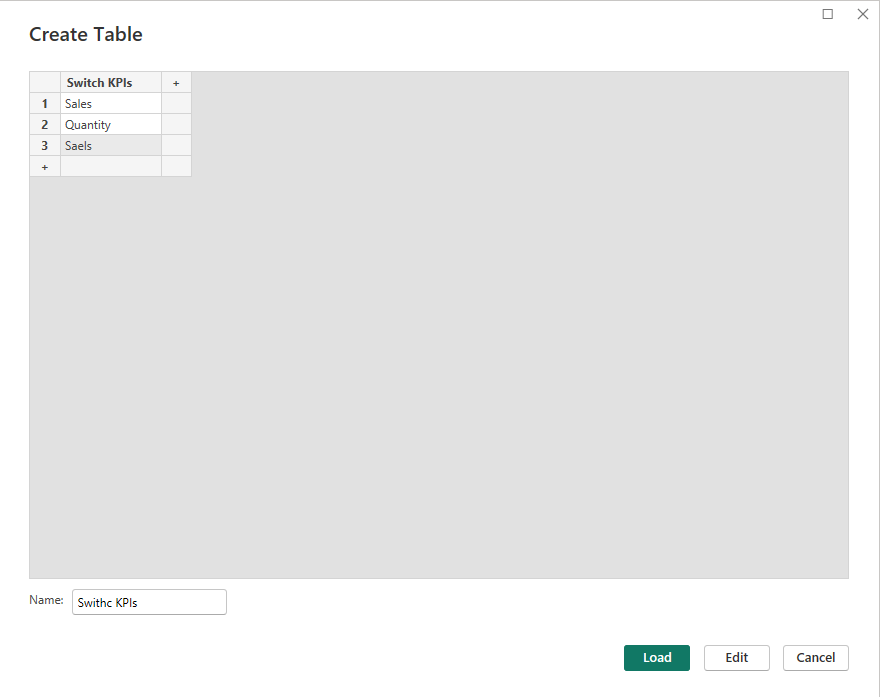
Step 1: Creating the "Switch KPIs" Table
The first step is to create a table to allow users to select different KPIs dynamically.
Steps to Create "Switch KPIs" Table:
- Create a table named "Switch KPIs" with values: Sales, Quantity, Profit.
- Use this column as a slicer for dynamic KPI selection.
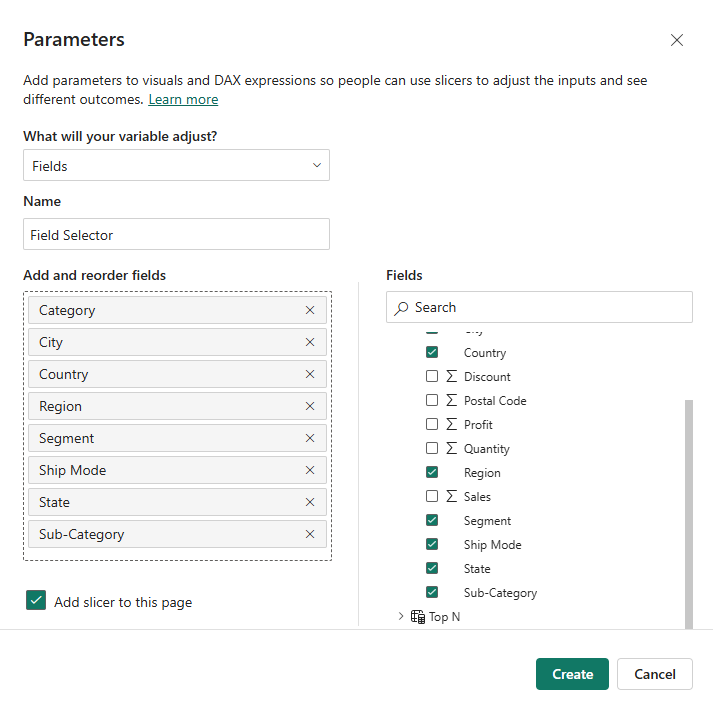
Step 2: Creating a Field Parameter for Field Selector
This parameter allows users to choose which field or dimension they want to analyze (e.g., Category, City, Segment). You can create a Field Parameter called Field Selector with the following fields:
- Category
- City
- Segment
- Ship Mode
- Sub-Category
Step 3: Creating the "Switch KPIs" Measure
To dynamically display values based on the selected KPI, I created the following measure:
Switch KPIs = SWITCH(SELECTEDVALUE('Switch KPIs'[Switch KPIs]),"Sales", [Total Sales],"Quantity", [Total Quantity],"Profit", [Total Profit],[Total Sales])
This measure dynamically switches between Total Sales, Total Quantity, and Total Profit based on the user's selection in the Switch KPIs slicer.
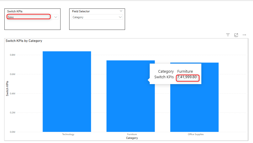
Step 4: Visualizing the Selected KPI
Now, you can use a stacked column chart to visualize the selected KPI dynamically.
- Place the Field Parameter on the X-axis.
- Add the Switch KPIs measure on the Y-axis.
Now, when you select Sales and City in the slicers, the chart will correctly display Sales by City.

The Formatting Problem
While the dynamic KPI selection worked, the formatting was inconsistent:
- Sales and Profit should have a dollar ($) symbol.
- Quantity should remain a general number format.
By default, Power BI applies a single formatting style to a measure, which means you can't assign different formats to different KPIs dynamically.
Step 5. Resolving the Formatting Issue Using Dynamic Format String
To fix this, we used Power BI’s Dynamic Format String feature. Here's how:
Enabling Dynamic Format String
1. Click on the Switch KPIs measure.
2. Go to the Measure Tools ribbon.
3. In the Format dropdown, select Dynamic.
Defining Dynamic Format
I then entered the following format string:
IF(SELECTEDVALUE('Switch KPIs'[Switch KPIs])= "Sales", "$#,##0",IF(SELECTEDVALUE('Switch KPIs'[Switch KPIs])= "Profit", "$#,##0", "#,##0"))
This ensures:
- Sales and Profit values appear with a dollar symbol ($).
- Quantity remains a regular number format.

Conclusion
Using Dynamic Format String, I was able to resolve the formatting inconsistency in my Switch KPIs measure. Now, users can dynamically switch between KPIs without losing appropriate formatting for each metric.This feature is particularly useful when dealing with mixed data types (currency vs. general numbers) in Power BI visualizations.