How to Apply a Top N Filter Using Field Parameters and Measures in Power BI

In this blog post, we will walk through the steps to implement a Top N filter in Power BI, where the data shown in a visual can dynamically change based on selections made using field parameters. Specifically, we will demonstrate how to change the visual based on the Top N values for different KPIs (e.g., Sales, Quantity) and dimensions (e.g., Category, City, Segment) based on the user's selection.

Step 1. Creating a Field Parameter for Top N Values

To begin, we need to create a Field Parameter for the Top N filter. A field parameter allows you to dynamically switch between different values (e.g., showing the top 5 or top 10 results).

Steps to Create a Field Parameter:

  • In Power BI, go to the Modeling tab.
  • Click New Parameter > Field Parameter > Numeric Range.
  • In the dialog box, set the following:
    • Field Parameter Name: Top N
    • Data Type: Whole Number
    • Minimum Value: 5
    • Maximum Value: 20
    • Increment: 5
    • Default: 5
  • This creates a numeric parameter where users can select the top N values, ranging from 5 to 20 with increments of 5.
Power BI Field Parameter Example

Step 2. Creating Measures for Total Sales and Total Quantity

Next, we create two basic measures: Total Sales and Total Quantity. These will be the KPIs that the user can select and analyze.

Measures for Sales and Quantity:

Total Sales:

Total Sales = SUM('SampleSuperstore'[Sales])

Total Quantity:

Total Quantity = SUM('SampleSuperstore'[Quantity])

These measures will serve as the foundation for switching between KPIs in the visual.

Step 3. Creating a Field Parameter for KPIs

To allow users to switch between different KPIs (Sales and Quantity), we create another Field Parameter called KPIs.

Steps to Create the KPIs Field Parameter:

  • Go to Modeling > New Parameter > Field Parameter.
  • Set the Field Parameter Name as KPIs and select the KPIs (Sales and Quantity) for the parameter.
Creating Field Parameter in Power BI

Step 4: Creating a Field Parameter for Field Selector

This parameter allows users to choose which field or dimension they want to analyze (e.g., Category, City, Segment). You can create a Field Parameter called Field Selector with the following fields:

  • Category
  • City
  • Segment
  • Ship Mode
  • Sub-Category

Steps to Create the Field Selector Parameter:

  1. Go to Modeling > New Parameter > Field Parameter.
  2. Add fields like Category, City, Segment, Ship Mode, and Sub-Category to the parameter.
Field Selector Parameter Example

Step 5. Creating the KPI Column

Now, we create a calculated column in "KPI Field Paramter" to store the selected KPI value from the KPIs field parameter. This will help in dynamically displaying either Sales or Quantity.

Calculated Column for KPI:

KPI column = KPIs[KPIs]

This column simply reflects the value selected from the KPIs field parameter, which can be either Sales or Quantity.

Step 6. Creating the Switch Filter Measure

Now we need to create a measure to switch between the KPIs based on the selected field in the KPIs parameter.

Switch Filter Measure:

Switch filter KPIs =
SWITCH(
SELECTEDVALUE(KPIs[KPI column]),
"Quantity", [Total Quantity],
"Sales", [Total Sales],
BLANK()
)

The SWITCH function checks the selected value of KPIs[KPI column] and returns either the Total Quantity or Total Sales measure based on the selection. If no valid selection is made, it returns BLANK().

Step 7. Creating the Rank Measure

We need to rank the selected data based on the field chosen in the Field Selector (Category, City, etc.). The rank will be calculated using the RANKX function.

Rank Measure:

Rank =
SWITCH(
TRUE(),
SELECTEDVALUE('Field Selector'[Field Selector Fields]) = "Category",
RANKX(
ALLSELECTED('SampleSuperstore'[Category]),
[Switch filter KPIs],
,DESC
),
SELECTEDVALUE('Field Selector'[Field Selector Fields]) = "City",
RANKX(
ALLSELECTED('SampleSuperstore'[City]),
[Switch filter KPIs],
,DESC
),
SELECTEDVALUE('Field Selector'[Field Selector Fields]) = "Segment",
RANKX(
ALLSELECTED('SampleSuperstore'[Segment]),
[Switch filter KPIs],
,DESC
),
SELECTEDVALUE('Field Selector'[Field Selector Fields]) = "Ship Mode",
RANKX(
ALLSELECTED('SampleSuperstore'[Ship Mode]),
[Switch filter KPIs],
,DESC
),
SELECTEDVALUE('Field Selector'[Field Selector Fields]) = "Sub-Category",
RANKX(
ALLSELECTED('SampleSuperstore'[Sub-Category]),
[Switch filter KPIs],
,DESC
)
)

The SWITCH(TRUE()) function ensures that multiple conditions can be evaluated. The condition checks which field (e.g., Category, City, etc.) is selected in the Field Selector.

The RANKX function ranks the data for each selected field based on the selected KPI (Sales or Quantity). We use ALLSELECTED to rank across the selected data.

Step 8. Creating the Top N Measure

We now create a measure that filters the top N based on the selected rank.

Top N Measure:

Top N =
var selectednumber_ = SELECTEDVALUE('Top N'[Top N])
RETURN
INT(
[Rank] <= selectednumber_
)

This measure checks if the rank is less than or equal to the selected Top N value. If true, it returns 1 (showing the item), otherwise, it returns 0.

Step 9. Building the Visual

Finally, we create a donut chart to display the results.

Steps to Build the Donut Chart:

  • Add the Switch filter KPIs measure to the Values of the donut chart.
  • Add the Field Selector parameter to the Legend.
  • Add the Top N measure as a Visual Level Filter and set it to is 1.

These steps will help you visualize the selected KPI, filtered by the Field Selector and Top N measure.

Donut Chart Example

Step 10. Using the Slicers

In this step, we add slicers to enhance the interactivity of the report. These slicers will allow users to filter and interact with the data more effectively.

Steps to Add Slicers:

  • KPIs: Select between Sales and Quantity.
  • Field Selector: Choose between Category, City, Segment, Ship Mode, or Sub-Category.
  • Top N: Choose the number of top records to display (e.g., Top 5, Top 10).

These slicers will provide dynamic control over the data displayed in your visual, allowing for more customized analysis.

Slicers Example

How the Visual Works

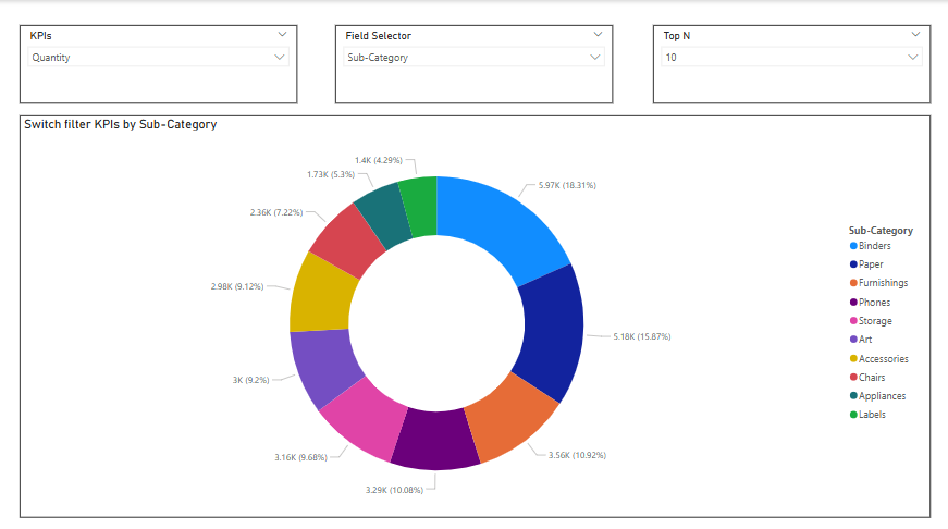
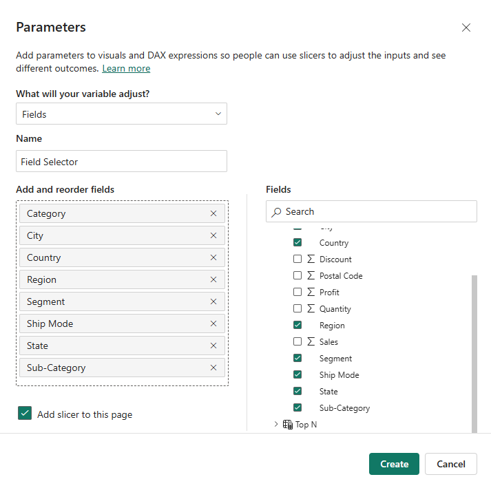
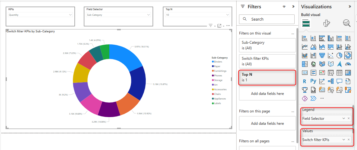
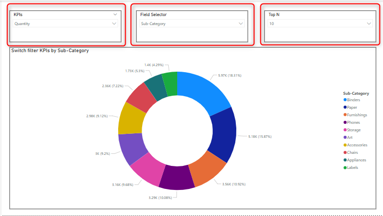
When you select a field (e.g., City) from the Field Selector slicer, the visual will show data based on that field (e.g., Top 10 cities).

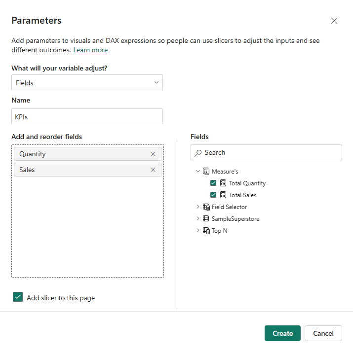
When you select a KPI (e.g., Quantity) from the KPIs slicer, the visual will update to show the top 10 cities based on the selected KPI (e.g., quantity).

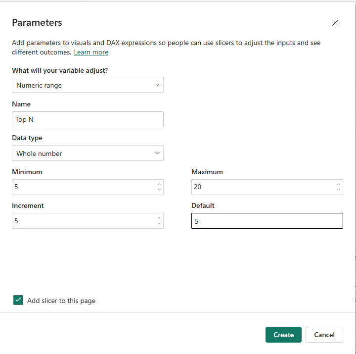
The Top N slicer will limit the visual to show only the top N records based on the selected rank.

How the Visual Works

Conclusion

By using Field Parameters, SWITCH, RANKX, and Top N measures, we created a dynamic Power BI report that allows users to interactively filter and display the top N values for different KPIs and fields. This solution provides a flexible and scalable way to analyze data by different dimensions and KPIs, offering enhanced insights for decision-making.