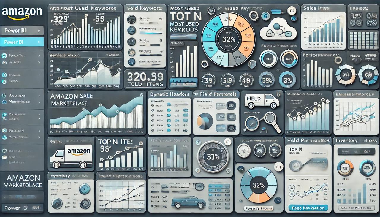
Powering E-Commerce Growth: A Power BI Solution for Amazon Marketplace Insights

Note: This is an AI-generated image and not an actual dashboard.
Create a Power BI dashboard for an online retailer that sells products on Amazon to track sales, customer behavior, and inventory control. The dashboard is designed to offer practical insights that can be used to improve customer happiness, streamline inventory procedures, and optimize sales strategies.
The Core Challenges
-
Data Modelling:
Setting up the connection between different tables to make sure data is linked correctly.
-
Data Integration:
Bringing together data from various sources and ensuring it fits together seamlessly in the dashboard.
-
Complex Measure Creation:
Fulfilling client requests that involve creating advanced measures and columns within the report.
Solution
In order to ensure smooth data flow, I precisely linked tables in Power BI to overcome data modeling difficulties. I have created a unified and informative dashboard by integrating many data sources and creating complex calculations to satisfy complicated client needs.
-
Comparative Analysis:
Enhanced capabilities to assess sales results across time periods in order to gain deeper understanding.
-
Employ Field Parameters:
Field parameters were included to make it simple for users to navigate between various data representations.
-
Dynamic Headers:
To improve user experience and clarity, dynamic headers were created that alter dependent on slicer options.
-
Configuration for Lookback Days:
Configuring the dashboard to examine a predetermined number of days in the past enables trend analysis and performance comparisons over the specified period of time.
Using a Variety of Data Sources to Gain Better Understanding
This data fusion process consolidates diverse e-commerce data streams, simplifying analysis and visualization. By integrating Amazon Marketplace data seamlessly, our client gains a comprehensive view of their operations, facilitating informed decision-making and strategy refinement. The different data sources that are used in the client are as follows:
Excel
CSV
Google BigQuery

Customization
I made a number of changes to my Power BI report to facilitate data exploration and give users more in-depth understanding.
-
Keyword Analysis with Cloud Chart
To help in finding common search phrases and content optimization, I put in place a cloud chart to show the most utilized keywords.
-
Gauge Visual for Performance Indicators
To facilitate fast evaluation of progress towards goals, I employed gauge visuals to display performance indicators.
-
Unichar Icons for Trend Visualization
Icons help people understand trends more easily and make better judgments.
Enhancement
By incorporating practical features this dashboard now has a number of features that enhance its usability and functionality.
Page Navigation
Facilitated simple page navigation for a smooth user experience while switching between reports.
Top N Filtering
Based on user decision, filters were implemented to show the top N items, emphasising the most crucial information.
Customised Tooltips
Specifically designed tooltips that offer more information and context as soon as the user hovers over them.
Page Level Filters
By applying filters at the page level, reports can be further refined according to certain standards, enabling focused study.