Power BI Dashboard for Restaurant Financial Performance & Sales Operations

Note: This is an AI-generated image and not an actual dashboard.
The objective of this Power BI dashboard project was to deliver a centralized, intuitive, and dynamic reporting solution for a restaurant business, focusing on financial performance, sales operations, and labour cost efficiency. By integrating transactional data across multiple categories—such as net sales, gross profit, expenses, and staffing—the dashboard empowers restaurant stakeholders to make informed, data-driven decisions that enhance profitability, control operational costs, and align daily performance with strategic goals.
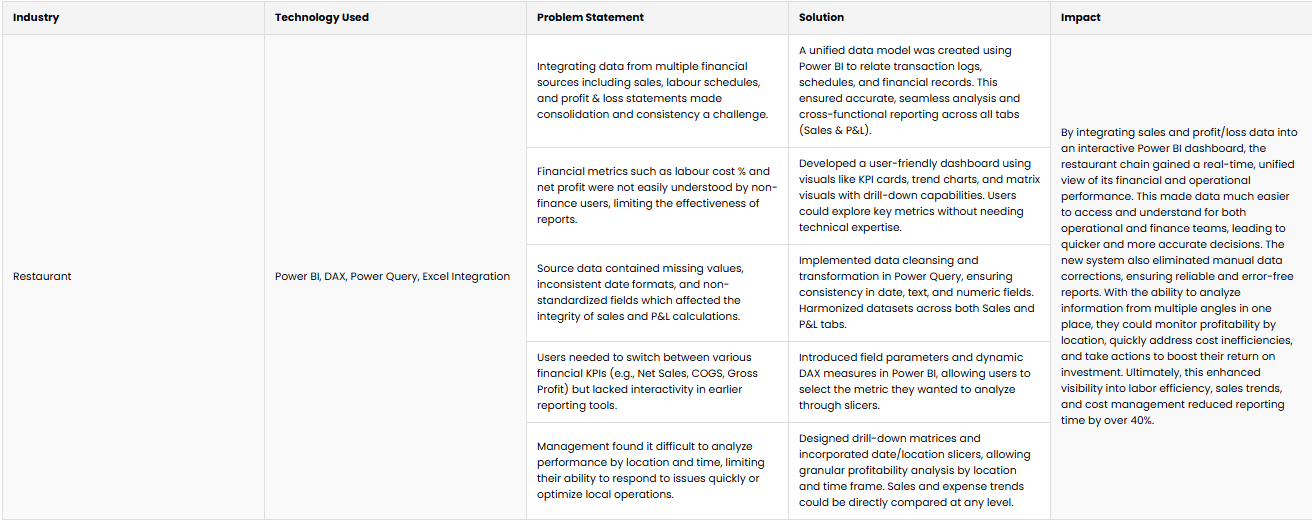
| Industry | Technology Used | Problem Statement | Solution | Impact |
|---|---|---|---|---|
| Restaurant | Power BI, DAX, Power Query, Excel Integration | Integrating data from multiple financial sources including sales, labour schedules, and profit & loss statements made consolidation and consistency a challenge. | A unified data model was created using Power BI to relate transaction logs, schedules, and financial records. This ensured accurate, seamless analysis and cross-functional reporting across all tabs (Sales & P&L). | By integrating sales and profit/loss data into an interactive Power BI dashboard, the restaurant chain gained a real-time, unified view of its financial and operational performance. This made data much easier to access and understand for both operational and finance teams, leading to quicker and more accurate decisions. The new system also eliminated manual data corrections, ensuring reliable and error-free reports. With the ability to analyze information from multiple angles in one place, they could monitor profitability by location, quickly address cost inefficiencies, and take actions to boost their return on investment. Ultimately, this enhanced visibility into labor efficiency, sales trends, and cost management reduced reporting time by over 40%. |
| Financial metrics such as labour cost % and net profit were not easily understood by non-finance users, limiting the effectiveness of reports. | Developed a user-friendly dashboard using visuals like KPI cards, trend charts, and matrix visuals with drill-down capabilities. Users could explore key metrics without needing technical expertise. | |||
| Source data contained missing values, inconsistent date formats, and non-standardized fields which affected the integrity of sales and P&L calculations. | Implemented data cleansing and transformation in Power Query, ensuring consistency in date, text, and numeric fields. Harmonized datasets across both Sales and P&L tabs. | |||
| Users needed to switch between various financial KPIs (e.g., Net Sales, COGS, Gross Profit) but lacked interactivity in earlier reporting tools. | Introduced field parameters and dynamic DAX measures in Power BI, allowing users to select the metric they wanted to analyze through slicers. | |||
| Management found it difficult to analyze performance by location and time, limiting their ability to respond to issues quickly or optimize local operations. | Designed drill-down matrices and incorporated date/location slicers, allowing granular profitability analysis by location and time frame. Sales and expense trends could be directly compared at any level. |