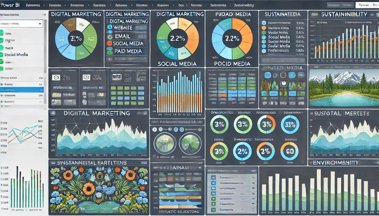
Note: This is an AI-generated image and not an actual dashboard.
The object of this project is to develop comprehensive Power BI dashboards for the tourism industry, focusing on digital marketing and sustainability metrics. The dashboards include four tabs for digital marketing—website, email, social media, and paid media—and three tabs for sustainability—social, environmental, and economic. These insights aim to enhance marketing strategies and monitor sustainability efforts effectively.
Incomplete data made it difficult to verify the accuracy of measures and calculations.
Required creation of 18 distinct destination measures across various tables, each with unique dashboard files for specific destinations.
Managing and implementing complex dashboard functionalities posed significant challenges in ensuring seamless operation.
In order to ensure smooth data flow, I precisely linked tables in Power BI to overcome data modeling difficulties. I have created a unified and informative dashboard by integrating many data sources and creating complex calculations to satisfy complicated client needs.
Developed measures that adjust dynamically with data updates and slicer selections, ensuring accurate and responsive visualizations.
Utilized field parameters and bookmarking within a single dashboard tab to streamline data filtering and enhance user navigation.
Applied dynamic formatting features to automatically adjust the presentation of values, improving clarity and readability.
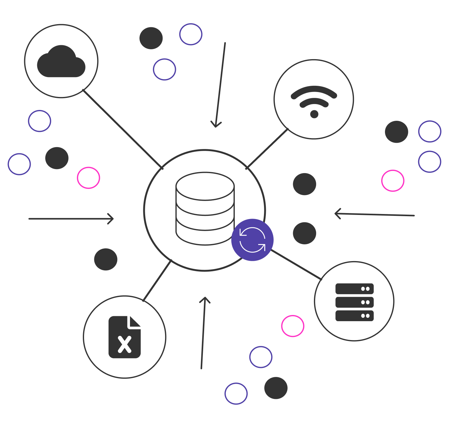
This project consolidates digital marketing and sustainability data from a single source, an online Excel spreadsheet, to streamline analysis and visualization. By integrating data directly from this centralized location, the client achieves a cohesive view of their performance metrics, enabling more effective decision-making and strategic adjustments. The data source utilized in this project is:
I made a number of changes to my Power BI report to facilitate data exploration and give users more in-depth understanding.
I introduced a dynamic heading measure that automatically updates the dashboard title based on the selected KPI, providing users with a clear and contextualized view of their analysis, enhancing focus and relevance in data interpretation.
By incorporating practical features this dashboard now has a number of features that enhance its usability and functionality.
I have implemented a hierarchical page navigation system, allowing users to effortlessly drill down into specific data layers, providing a more structured and intuitive exploration of the dashboard.
Visual interactions were adjusted to separate metrics, enabling users to compare different data points without cross-filtering. This enhancement allows for more accurate comparisons and deeper insights.
Incorporated bookmarking features to allow users to easily switch between different chart views and data representations, enhancing dynamic data exploration within the same dashboard.
Added synchronized slicers across all pages, ensuring consistent filtering across different analyses. Users can now select a filter once and view multiple analyses based on the same filtered year.